

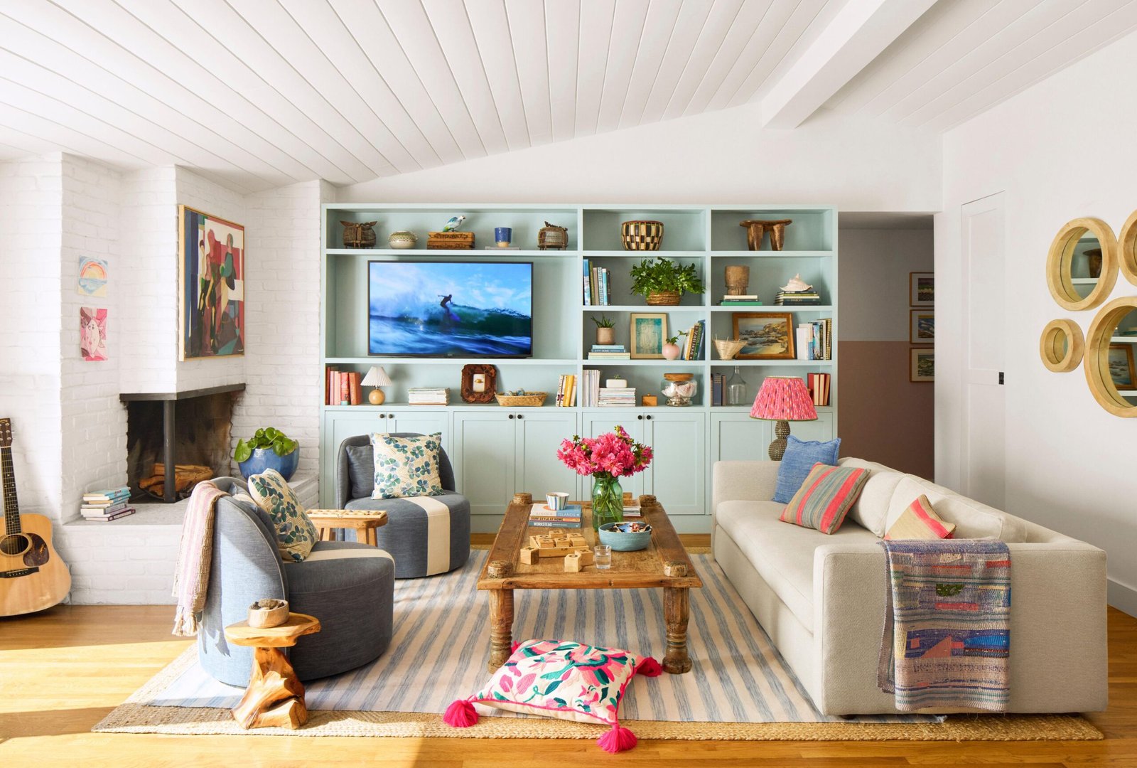
The living room is usually the most heavily used space in a home, hosting everything from family dinners to guests dropping by, movie nights and everyday downtime. Because of this, choosing a colour for it carries more weight than picking a shade for a spare room or a rarely used corner.
Homeowners in Gurgaon planning home painting for their living space often focus purely on aesthetics, only to realise a few months later that the colour doesn’t quite suit how the room is actually used day to day.
Think About How the Room Is Actually Used
Before looking at shade cards, consider the room’s real function in your household. Is it mainly used for relaxed family time, or does it double as a space for entertaining guests and hosting gatherings? A living room used primarily for quiet family evenings can afford calmer, more muted tones, while one that regularly hosts guests might benefit from a slightly bolder, more energetic palette. There’s no single “correct” colour for a living room; the right choice depends on the mood you want the space to support most often.
Account for Natural and Artificial Light
Living rooms often have the most windows and the most varied lighting conditions in a home, morning sun, afternoon shade, and evening artificial lighting all in the same day. A colour that looks fresh and bright in the morning can appear duller or take on an unexpected undertone by evening under yellow-toned lighting. Always test a sample patch directly on your living room wall and observe it across a full day before finalising, rather than judging from a small swatch under showroom lighting.
Factor in High Traffic and Durability
Since the living room sees more foot traffic, more contact with furniture, and generally more day-to-day wear than quieter rooms, durability matters more here than in a bedroom. A washable, more durable finish, such as satin rather than a purely matte one, holds up better against occasional marks, spills or the friction of furniture being moved. Choosing purely on colour without considering finish durability often means more frequent touch-ups in exactly the room that’s hardest to take out of use for repainting.
Consider How the Colour Connects to Adjoining Spaces
In most homes, the living room is visually connected to a dining area, entryway or passage, so the colour chosen shouldn’t feel isolated from what’s next to it. If your living room opens directly into another space, look at how your chosen shade transitions at that boundary rather than treating the living room as a completely separate decision. A jarring contrast at a doorway can undercut an otherwise well-chosen colour.
Avoid Trend-Only Decisions
It’s tempting to pick a colour purely because it’s currently popular, but trends shift far faster than most people repaint. A shade that feels fresh today may feel dated within a few years, whereas a well-chosen neutral or classic tone, paired with colour introduced through soft furnishings, art or an accent wall, tends to age better and gives you more flexibility to update the room’s look without repainting the entire space again.
Get a Second, Expert Opinion
Given how much time is spent in this particular room, it’s worth getting an expert consultation before finalising your choice, especially if you’re torn between a couple of options. An experienced colour consultant or painter can assess your room’s specific light, size and adjoining spaces, and may suggest a shade or texture combination you hadn’t considered, drawing on a far wider range of options, often running into thousands of shades, than most people browse through on their own.
Why Professional Application Still Matters for a Single Room
Even when only one room is being repainted, the quality of application affects how well the final colour reads on the wall. Uneven rolling, inconsistent coats or rushed cutting-in around trim and switchboards can make even a well-chosen colour look patchy or uneven under close inspection. Working with painting services that apply consistent, properly timed coats and check the finish under different lighting before calling the job done ensures the colour you carefully chose actually looks the way you intended once it’s on the wall.
Test Before You Commit
Whatever colour you’re leaning toward, paint a reasonably sized sample patch, not a tiny swatch, directly on the wall and live with it for a few days before finalising. Living rooms are unforgiving of colour regret precisely because they’re used so often and by so many people in the household; a small investment in proper testing upfront avoids a costly repaint down the line.
A Colour Worth Living With
Choosing paint for a frequently used living space is less about finding a colour you like in isolation and more about matching that colour to how the room functions, how light moves through it, how much wear it needs to withstand, and how it connects to the rest of your home. Taking these factors into account before committing to house painting results in a living room that continues to feel right well beyond the first few weeks after the paint dries.